CPT Graph
Tab
Interactive depth-based charts with synchronized tooltips and pinned data points.
Tab Overview
The CPT Graph tab visualizes cone resistance, sleeve friction, pore pressure, and derived parameters as depth-based curves.
- Header — title and quick actions for the active CPT object.
- Toolbar — tooltip mode, settings, and pin controls.
- Settings panel — choose which graphs to display.
- Graph area — depth-based charts synchronized to the CPT trace.
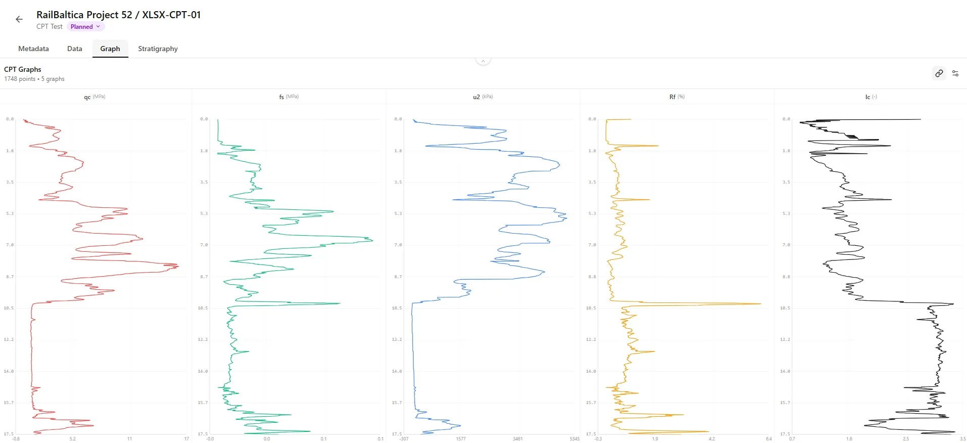
Available Graphs
Graphs are grouped into raw measurements (qc, fs, u2), corrected/normalized values, and derived engineering parameters.
Raw Measurements
| Parameter | Unit | Color | Description |
|---|---|---|---|
| qc — cone resistance. | |||
| fs — sleeve friction. | |||
| u2 — pore pressure at cone shoulder. | |||
| Temp | |||
| Tilt | |||
| Speed | |||
| γ - Unit weight. |
Calculated Values
| Parameter | Unit | Color | Description |
|---|---|---|---|
| Rf — friction ratio. | |||
| qt — corrected cone resistance. | |||
| u0 - Hydrostatic pore pressure. | |||
| Δu - Excess pore pressure. | |||
| σv0 - Total vertical stress. | |||
| σ'v0 - Effective vertical stress. | |||
| Qt — normalized cone resistance. | |||
| Fr — normalized friction ratio. | |||
| Bq — pore pressure ratio. | |||
| Ic — soil behaviour type index. |
Engineering Parameters
| Parameter | Unit | Color | Description |
|---|---|---|---|
| N60 — SPT equivalent. | |||
| Su — undrained shear strength. | |||
| E — Young's modulus. | |||
| M — constrained modulus. |
Default Selection
Borebase pre-selects the most useful graphs (qc, Rf, Ic) so analysis can start immediately.Selecting Graphs to Display
Click the settings button in the toolbar to open the graph selection panel.

Toggle checkboxes to add or remove graphs. Parameters are grouped by category.

- Color swatch — matches the line color used in the chart.
- Filled checkbox — graph is currently displayed.
- Close the panel to return to the graphs.
- Selections are saved automatically per object.
Practical Example
Showing only qc, Rf, and Ic gives a quick soil-behavior view for layering decisions.Tooltip Modes
Hover the chart to see depth-aligned values. Two modes control behaviour across charts.
Synchronized Mode
Synchronized mode shows tooltips for the same depth across every visible graph at once.


Single Mode
Single mode shows the tooltip only for the chart under the cursor.

Tooltip Contents
Tooltips display depth, raw value, derived value, and units.Pinning Data Points
Pin specific depths to keep their values visible while scrolling.
- Click a point on any chart to pin it.
- Pin multiple depths at once for direct comparison.
- Pins persist until you clear them or leave the object.
- Pinning marks the same depth across all visible charts in sync mode.
Clearing Pinned Points
Use the clear button in the toolbar to remove all pinned points at once.

Practical Example
Pin the depth of a sharp qc drop and the matching Ic to confirm a soft clay layer.Graph Features
Each chart shares a common layout for fast scanning.
- Title — parameter name and unit.
- Depth axis (Y) — synchronized across all charts.
- Value axis (X) — scaled to the parameter range.
- Grid lines aid visual reading at depth.
- Line color matches the legend in the settings panel.
- Horizontal scroll appears when many graphs are selected.
Empty Graphs
Calculated graphs require their input parameters. Missing inputs leave the chart empty.
Data Required
Confirm cone factors, unit weights, and water level are filled in — they drive normalized and effective-stress calculations.Best Practices
Data Quality Checks
- Scan qc and fs for unrealistic spikes before relying on Ic.
- Verify u2 is monotonic with depth where expected.
- Compare Ic boundaries with stratigraphy entries for consistency.
- Pin questionable depths for later review with the field crew.
Soil Classification
- Display qc, Rf and Ic together to compare their depth profiles.
- Add Qt, Fr and Bq from the Calculated group when these values are available.
- Use synchronized tooltips to compare the selected parameters at the same depth.
Engineering Analysis
- Select Su, E and M in the Engineering group to display their depth profiles.
- Add N60 to display the equivalent SPT values calculated from CPT data.
- Click the graphs to pin depths and compare the displayed values at those levels.
- If a selected graph has no data, check the corresponding parameter in the Data tab.